
INSIGHTS / BRAVELY PROJECT
Designing a Website Path to WhatsApp with Context
READ WHAT MATTERS TO YOU
Where would you like to start?
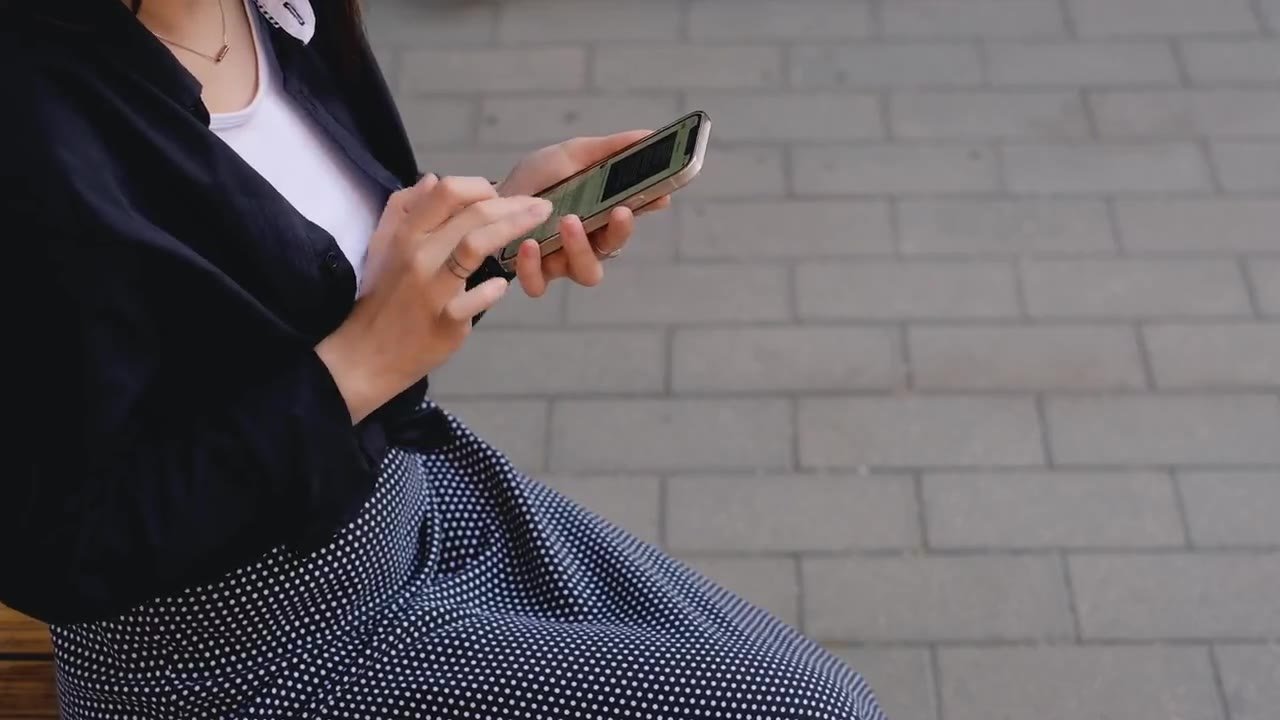
Good website flow to WhatsApp maintains context as visitors move from page to conversation. People new to a particular type of home or service should not have to repeat the entire information from the beginning, but should still have the option to modify and send their own message. The website's job is to make this step easier, not treat opening the application as a conversation that has already happened. This article covers how to design buttons, message content, device testing, and admin response as one journey that can be reviewed with marketing and operations teams.
As an initial check, choose one page that receives frequent contacts and follow all the steps as if you were a new visitor. Note any parts that still force you to remember or retype information from the previous page. This finding is more useful for initial design than changing the button color without knowing the actual channel switching resistance.
Map intent in website flow to WhatsApp
Start with a list of pages that have a contact button. Write down what visitors are deciding on each page: choosing a service, comparing types, checking locations, or requesting a quote. This context determines what information is worth bringing to the initial message; The page title alone does not necessarily explain the needs of the person contacting you.
As a hypothetical example, visitors to a warehouse catalog require extensive discussion and vehicle access. Visitors to articles about warehousing may just want to understand how to choose a location. Both can use WhatsApp, but the button labels and opening questions should reflect different decision stages.
Create a simple map that connects pages, needs, message context, and recipients. If one button leads to central admin, make sure the branch information is not lost. If multiple numbers are used, establish a selection rule before designing the display.
- Service page: brings the name of the service being viewed.
- Branch page: bring the appropriate location and contact line.
- Educational articles: offer a discussion of needs without assuming the reader is ready to buy.
Determine which contact actions can be served
The choice between requesting information, requesting a schedule, and requesting a quote has operational consequences. Schedule requests need to be checked against availability; the offer requires initial data; General questions can be handled by admin. Don't use a label that promises an instant solution if the message only opens the discussion stage.
In a hypothetical clinic example, the button could lead to an administrative schedule request, while condition assessment remains through the service personnel. In the contracting business, a button can offer an initial project discussion without promising a final estimate from a single message. This distinction helps users understand what happens after clicking.
Define the expected outcome of each action. If the team is only accepting requests at this time, state the need for confirmation on the page or in the reply message. Information on response hours can be included if operations are strictly followed, without making promises about times that have not been agreed upon.
Also review alternative channels for visitors who do not use WhatsApp. Email addresses, forms, or telephone contacts can be provided according to business needs and recipient capabilities. The website still needs to provide a way to achieve the goal even if an application is not available.
Write a button label that explains the next step
Labels like Contact Us can work in general navigation, but are less helpful when the page has a specific purpose. Use words that mention the action and the object, for example Discuss Warehouse Needs or Ask about Branch Schedules. The length of the label needs to be tested on the phone so that it does not get cut or lose meaning.
MDN's accessibility guidelines emphasize the importance of making content usable by people with different abilities and devices. In the context of contact buttons, clear names help users understand the purpose of the control before activating it. Look What is accessibility? from MDN Web Docs.
The WhatsApp icon can support recognition, but the text still needs to explain the action. Avoid making small icons the only clue, especially when several buttons are close together. The order of focus and keyboard usage also needs to be checked by the technical implementer.
In the hypothetical example of a villa page, Ask Villa Dates provides more precise context than Book Now when availability is still being checked manually. Review labels with admins: are the conversations being invited appropriate for the tasks they are capable of handling? Use those answers as button approval criteria.
Provide a way to maintain context when choices are incomplete. As a hypothetical example, a user lands on a page of several home types but has not yet selected a type. The initial message can mention the project and the need to compare options, then leave room for explanation. Forcing the last seen type name can make admins think the decision has already been made. Check whether the context comes from user choice or simply the state of the page that happens to be open.
Craft the initial message without carrying sensitive data
The initial message simply contains the identity of the service, branch or product being viewed and space for the user to explain their needs. Avoid entering personal data into link addresses if it is not necessary. Page context can help admins without copying the entire form content or sensitive information.
As a hypothetical example: Hello, I would like to discuss website services for restaurant businesses. I read the restaurant page and wanted to explain our outlet needs. This message states the need, but does not specify the name, number of outlets, or user budget.
The WordPress privacy documentation helps website owners review the data collected and how to explain its use. Applications to forms and contact links need to follow the actual collection goals and business processes. Look WordPress Privacy from WordPress Documentation.
In healthcare, administrative requests do not require a diagnosis, photo of the condition, or medical history via a marketing link. In financial services, do not add account identification or customer documents to automatic messages. Ask for only the context necessary to determine initial follow-up.

Preserve user choice for sending messages
Opening a draft message is different from sending a chat. Good design helps users examine content, refine choices, and decide whether to continue. A caption near the form could explain that the button opens WhatsApp with a draft, so the user understands channel switching.
Don't call a button a sent message if its implementation only opens a link. Confirmation on the website must follow a provable event. When a user returns without submitting, the system should not assume they have received an explanation from the admin.
In a hypothetical example of a project form, the user selects a service category and writes a note. After pressing the button, WhatsApp displays an editable draft. Sensitive records should not be requested from the initial form, and submission remains at the discretion of the user in the application.
These differences also affect measurements. CTA clicks are website interactions; the conversation the admin received was another incident. Use metric names that reflect these limits so that teams don't read entire app opens as potential customers who have already communicated.
Test the move on mobile and desktop
Testing needs to include installed applications, WhatsApp Web, as well as devices that do not yet have an active session. Check that the message context carries over, the destination number is correct, and the user understands any sign-in steps that may appear. Don't just test from a website creation tool that already has a complete configuration.
MDN's responsive design guide describes an approach to adapting interfaces to device and screen size. Contact buttons and forms need to follow these principles so that their flow can be used on different views. Look Responsive web design from MDN Web Docs.
Use a hypothetical example containing symbols, newlines, and long product names to check the draft results. Also test for fill-in-the-blanks, validation errors, and keyboard navigation. Test data does not need to be sent to a real admin to prove that the draft has been formed correctly.
- Check the destination number and country code on all key locations.
- Compare the contents of the form with the draft, including special characters.
- Test the back button so users don't lose fields without explanation.
- Note the behavior when an application or web session is unavailable.
Also test changes to the content before the button is opened again. In the hypothetical example of a service form, the user switches branches after the first draft is formed. Subsequent links need to carry the newest options so that old information is not left behind. Record test results for these conditions, especially if the website uses components that store temporary conditions. This test helps ensure context remains accurate without requiring users to repeat the entire form.
Coordinate page buttons and floating buttons
Floating buttons are typically available on many pages, while buttons within content can carry more specific context. Both need to follow consistent rules. If the floating button always leads to central admin, explain what it does and avoid pointing it to branch numbers that change without instructions.
Make sure the floating control doesn't cover form buttons, consent text, or mobile navigation. Check screen shortening, text zooming, and conditions when the keyboard is open. Positions that look neat on a large screen can get in the way of key actions on other devices.
In the website flow to WhatsApp, consistency does not mean all messages must be the same. Catalog buttons can carry product codes, while general buttons carry page names. Context source rules must be documented so that template updates do not silently delete important information.
Use the button location list when making number or message changes. The inspection includes headers, footers, articles, popups that are still in use, and service page components. One old link may send a request to a recipient who no longer handles business.
Align admin responses with the received context
Good context doesn't help much if the admin replies with a question the user has already answered. Develop a guide to reading the initial message and determining subsequent questions. Admins need to check the categories, branches, and requirements mentioned before using standard replies.
As a hypothetical example, a prospective client's message mentions the need for a website for several restaurant outlets. Replies can ask about the current website and menu update issues, rather than asking again about the type of business. This guide keeps the conversation feeling continuous without pushing the offer too quickly.
Note the message theme remains incomplete even though the button already carries context. If many users choose the wrong branch, correct the selection on the website. When context is truncated, check link formation. If relevant questions are not addressed, please review the admin's division of labor before changing the ad.
Provide the owner with periodic testing of website flow to WhatsApp. Numbers, operating hours, service categories and receiving teams are subject to change. Concise documentation on buttons, drafts, and how to follow up makes operational changes easier to implement without breaking the visitor journey.
Review the single most frequently used ride before replacing the entire switch. Once the context, user preferences, and admin response are aligned, extend the same pattern to other pages based on their individual needs, then document the checks for future updates.
Reading to support your decision
- Mobile Website Forms: Enough Data, Easy Filling
- Contact Page that Helps Visitors Contact the Business
- Advertising Messages and Landing Pages: Avoiding Context Disconnects
- Lead Response Flow: From Website Form to Sales Team
Implementation can be customized for Landed House Housing, Beauty Clinic, Daily Car Rental, Restaurant.
Discuss implementation needs through services website creation, SEO, or digital advertising management Bravely. The scope of work follows the problem, material readiness and operational flow of your business.
Official sources
- What is accessibility? — MDN Web Docs
- Responsive web design — MDN Web Docs
- WordPress Privacy — WordPress Documentation
Practical questions before you start
Does the WhatsApp button have to carry a long message?
No. Short context in the form of a service, product, or branch is usually easier for users and admins to check. Add only the information needed for the next step; additional details can be asked after the conversation begins.
Can button clicks be reported as leads?
Clicks can be recorded as contact interactions, but the definition should be clear. If a business refers to leads as relevant conversations received, that number needs to be differentiated from website clicks and requires receiving team feedback.
How to start if many buttons are already scattered?
Inventory all button locations, destination numbers, and draft contents. Select a priority page, test device switching, then match component rules. Incremental changes are easier to check when a list of locations and responsible persons is available.
In this article
- Map intent in website flow to WhatsApp
- Determine which contact actions can be served
- Write a button label that explains the next step
- Craft the initial message without carrying sensitive data
- Preserve user choice for sending messages
- Test the move on mobile and desktop
- Coordinate page buttons and floating buttons
- Align admin responses with the received context
- Practical questions before you start